Posters 1-4: One Flew Over the Cuckoo’s Nest / Apocalypse Now / The Shining / The Elephant Man - Leszek Zebrowski (b. 1950)


Zebrowski’s work serves the same purpose as the traditional American style film posters that we are more familiar with, in so much as communicating to the prospective audience the key details about the film, such as thematic tone, cast and/or director, but with considerable artistic license to interpret the film’s less immediately definable qualities to create an advertisement that taps into a part of the film that is more part of it’s structure, or ‘DNA’. For instance, there is a significant thematic difference between the two posters for One Flew Over the Cuckoo’s Nest, with the American poster showing Jack Nicholsons’ character smiling and in conjunction with the bubbly, uneven typeface, audiences might expect a comedy, or at least a comedic take on a more serious topic. The film itself has humour within it, but it is always in the context of characters with serious psychological problems and there is tragedy and injustice deeply woven into the story that is not illustrated by the poster. Zebrowski’s poster, on the other hand, directly references one of these tragic moments towards the end of the film, but this would only be obvious to someone already familiar with that scene, and by the expressionistic nature of the poster you can initially only sense at the tone of the film, without having details revealed. His chosen typeface also is loose and subtle in it’s presentation, coming secondary almost to the image itself, which is a recurring element in his poster work.
With the American poster of Apocalypse Now, there is a fairly expressionistic affectation already present, and the typeface illustrates also a loose, rough characteristic that matches with the film’s themes. Being set within the Vietnam war, and being a sort of travelogue of the horrors of war, and of madness, the film’s themes are well represented. Zebrowski’s take is in comparison more vibrant and less depressive, with bright red as the background tone and similarly to the American poster, Marlon Brando’s face appears centrally, but Zebrowski illustrates more about the character of Kurtz and his insanity, showing him as fragmented as if by an explosion of artillery.
The typeface Zebrowski uses is likewise colourful and bold, with attentuation to the first letter of each word which serves to draw your attention and the teal hue contrasts clearly with the pinks and reds.
For The Shining, the original poster is representing just one specific scene, broken into two key shots, with a tagline present above to emphasise the films potency and success in America. I believe although I am not certain that this poster was for the UK market, so the phrase serves to indicate the presence of something monumental arriving on our shores. In other ways, the poster is fairly straightforward, with black and white used for text and background inversely and the typeface used being fairly simplistic, with alternative upper and lower case letters (upper case all except for the two uses of ‘i’). The first half ‘The Shining’ is smaller, to emphasise the word ‘Shining’. Zebrowski’s take on the film draws upon the same scene, which is perhaps the most famous scene in a film that has drawn reference and pastiche many times since it’s release in 1980, but amusingly emphasises and exaggerates the elasticity of Shelley Duvall’s distinct facial features, and also her pallid skin tones as she appears in the film, reminding us of The Scream by Munch. The background is also pale, but with contrasting black lines emanating from the shape of Duvall’s head again further emphasising her expression and presence. I believe this is a non-too subtle comment on her performance in the film, which could be regarded as over the top (indeed, every performance in the film is excitable and exaggerated, as you can see from Jack Nicholson’s expression in the other poster). Her character Wendy serves as a point of irritation for Nicholsons’ Jack, and in that sense it is inspired casting, as she irritates the audience just as effectively.
With David Lynch’s The Elephant Man, the differences between posters become more significant. Lynch’s film is in itself a fairly expressionistic telling of the story of John Merrick, born with terrible disfigurements that alienate him from Victorian society and unfortunately hide his sensitivity and intelligence from view as well as a result. The film is black and white, and like Lynch’s Eraserhead before it, is full of high contrast and striking cinematography and oppressive and claustrophobic environments. The typeface used somehow doesn’t quite match the themes, and the inclusion of a key line of dialogue with additional emphasis undoes some of the great subtlety in John Hurts characterisation of John Merrick in the film. This is more likely symptomatic of studio interference or at least bland traditionalism within the advertisement realm of cinema at the time, and it is unlikely that a film’s creator get’s a great deal of influence on how a film is marketed, and the more money a studio invests in a film’s production the less control a director has on this area. Zebrowski takes a much more expressionistic approach to the film’s subject matter, choosing to ignore the details so much of John Merrick’s features, and instead reinterpreting them in his own way so as to emphasise the emotional content without the need for text to explain it. The oversized teardrops emerging from a wide horizontal line where the eyes should be appears to resemble more a cliff face or a break in a plaster wall than a normal healthy face. This of course perfectly represents the key point of Merrick’s plight, but not in a directly representational way.
Poster 5: Mulholland Drive (2 posters) - Sława Harasymowicz

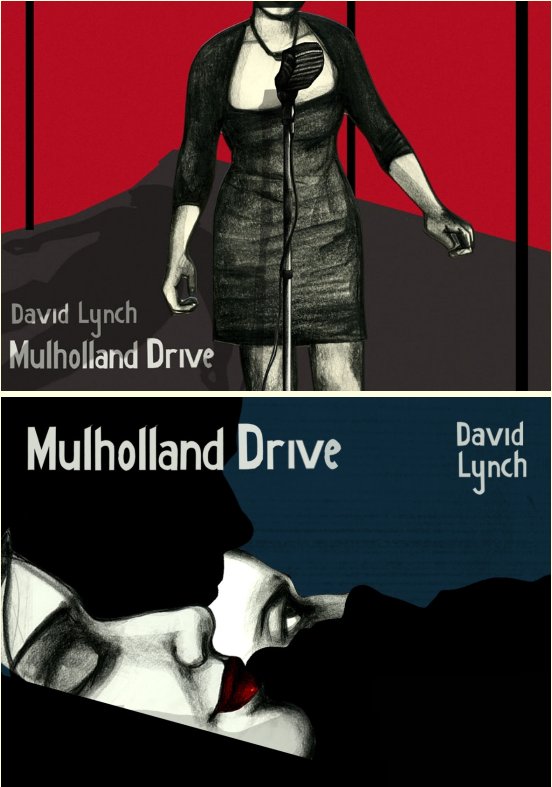
The French film poster for Lynch’s Mulholland Drive is one of several interesting interpretations to choose from for this film, and I selected this one in particular because there are a variety of different elements that are ripe for comment. Thematically the film itself is dreamlike, abstract and open to interpretation in a variety of ways and in many ways is ‘about’ Hollywood - Hollywood films and their conventions, as well as the romance surrounding the idea of Hollywood and the film business as a whole. The poster itself is visually rich, with high contrast and deep shadows, creating a sense of mystery and intrigue surrounding the two central female characters. In the lower-right third of the frame there is an image referencing one of the more bizarre sequences, itself likely alluding to Lynch’s own Twin Peaks and Fire Walk With Me, keeping in again with the motif within Mulholland Drive of referencing the genetic structure of film and TV within our collective subconcious. There is much to be said about this film. The typeface and use of text in general highlights it’s accolades and awards, but allow the images themselves to dominate the impression the poster will make on the observer.
Sława Harasymowicz’s two posters for Mulholland Drive reference scenes and themes from the film respectively - the first an emotionally charged sequence inside an old theatre in the middle of the night, the second the intimate relatonship between the two lead characters (although this is a misnomer as throughout the film, characters, roles and roles within relationships switch around repeatedly). Stylistically the posters are fairly simplistic, with the first poster recreating the stage and the body of the singer in stark contrast to each other, the singer in monochrome and the curtains in deep red, as it appears in the film. The second poster is more abstract, showing the two leads lying next to each other, one asleep, one intently awake, here face cut off as if wearing a mask by silhouettes of the two characters facing each other as if to kiss. There is separation between the characters (an important theme in the film) and also a separation in foreground and background that is interesting and reminiscent of MC Escher’s work

Poster 6: Kill Bill Volume 1 - Jacek Rudzki


The standard poster design for this film in the international markets doesn’t vary a great deal, and is strikingly simple and effective in it’s design. The use of yellow and black is reminiscent of warning signs, and of wasps and other harmful things, and the outfit of Uma Thurman appears almost like camouflage against the yellow and black backdrop of the post. The red of the blood splatter following the line of the sword also provides dramatic contrast, and leaves no doubt as to what the film is about. The type face is no more subtle - strong, bold black text, combined with the plain alliteration of the title, really rams home the stylistic intent of the film. The film itself contains a lot more stylistic references to a wide variety of sources, ranging from 1970’s exploitation films to contemporary Japanese animation, perhaps somewhat messily juxtaposed, and this isn’t referenced in the post so much.
Rudzki’s poster takes the simplicity of the international poster and perfects it, keeping the colour sheme of red and yellow, but removing all details, reducing it to a singular defining feature, again taking the ‘heart’ of the film and summarising it for prospective audiences or people who already know the film and know the significance. The relevant information about the film is condensed into the shape of a sword, with the film’s title standing out as the hilt and the Miramax logo forming the base of the sword as it it curves downards in a distinctive fashion. There is little chance that an observer would not know immediately that swords play an important role in this film, whereas in the international poster, the sword is an addendum to Uma Thurman’s leading heroine, more of a tool than a character in it’s own right.
Poster 7: The Empire Strikes Back - Miroslaw Lakomski


The film posters of the Star Wars film series are particularly distinctive and share a common style with other films of the period, namely those involving George Lucas and/or Steven Spielberg (Raiders of the Lost Ark, E.T, etc), and are typically of a realistic painting style blending various leading characters and locales from the film into one large collage, again summarising what to expect from the film as a whole. The film itself is considered the darkest of the series, thematically, and as such the poster follows suit, illustrating the icy scenes and darkness of the films’ villain blending into outer space. The entire series of films has thematic continuity in it’s presentation, namely in the design of the opening titles and also on the titles of the film posters, reinforcing the Star Wars brand.
The poster by Lakomski follows the style of posters he designed for other Lucas/Spielberg films at the time, appearing to mix prints and spray paints to create bold, distinctive designs that directly reference some of the film’s most memorable moments. In this instance, the items featured are a secondary character and a weapon of war, amidst a blurry impression of space and with a variety of coloured shapes in lines at various points across the poster. Notably, the films’ signature title design is absent, and no attempt has been made to replicate it, leaving only a plain bold Polish translation above a smaller English version of the title. The poster is more functional in this respect than some of the others, but is interesting in it’s distinctiveness and alternative focus in comparison to the international poster.