17 Nov 2011

Egon Schiele


EGON SCHIELE

Egon Schiele was an Austrian born artist, trained under Gustav Klimt, who primarily focussed on portraits and who produced a great deal of self-portraits. He is well known for his unique approach to fthe figure, in particular his exaggerations of features and thematic obsessions with sex and death. At times his works were graphic and in early 1900's Austria he faced censure over the sexually explicit nature of his paintings, and was briefly imprisoned for having explicit worrks in his studio that could be visible to children. Infamously, one of his drawings was burned in front of Schiele by the judge of the trial. Despite this, Schiele found success towards the end of the First World War in a period in which he is considered to have been in his prime as an artist. The brutality of the war is reflected in his uncomfortable, jarring style of physical representation.

Schiele died aged 28 during the Spanish flu pandemic in October 1918. Though he died young, he was a prolific artist and produced hundreds of works that have come to be widely studied. His unconventional approach to portraiture is significant in it's contrast to more traditional styles of the time, and has been influential since.

The origins of Schieles very stylised approach to representing the figure are likely influenced by his obsessions with physical vulnerability, morbidity, sex, and the combinations of all of these facets. His characters, and particularly in his self portraits, are distorted, skeletal and look physically broken or sickly. Not all of his works are as extreme, however, and some of his works, though recognisably his, do not contain the physical pain present in his self portraits. It would appear that with these pieces especially there is a sense of body dysmorphia, as present in the sef portraits by Jenny Saville and other artists who are uncomfortable with their own self-image.

Schiele's use of colour is a key element of his 'sickly' style, painting flesh tones in off yellows, and creating bizarre skin contours and textures, emphasising and exaggering wrinkles, skin folds, muscle and bone structure.


16 Nov 2011

3D


3D 16-11

Today we learned plaster casting techniques and produced both a mould from damp clay and a then a solid piece of work made from plaster.

Plaster is made from powdered gypsum, which when mixed with water becomes thick like liquid cement, and creates an exothermic reaction as it hardens over a period of 15-20 minutes. Plaster remains relatively soft compared to concrete or similar mixtures, and so it can be filed down or have sand paper applied to it once it has hardened, which makes it ideal for artistic uses. Plaster must be treated with care as injury can occur if hands or fingers are left inside plaster as it is hardening – the exothermic reaction resulting in severe burns.

The clay mould also has to be strong enough to withstand the fairly considerable weight of the plaster in it's liquid state. The mould requires that containing barriers are in place as per the design, to contain the plaster as well as shape it. Most of the work produced today had leaks occur due to weaknesses in the mould, typically on joining edges, and hastily prepared reinforcements were needed to secure these weak points as plaster began to leak or spill out. Care has to be taken also to prevent air bubbles that can occur as the plaster is poured into the mould – banging on the surface of the work area can collapse some bubbles, but this is not necessarily wise depending on the fragility of the mould. Alternatively, the plaster can be upset gently by hands being applied to the surface, upsetting the contents, though again care must be taken to prevent damage to the mould and to prevent injury.

My mould leaked from several small points around the edges of joins, and the weight of the plaster was beginning to push the sides of the mould outwards, so string was used to reinforce the sides.

My mould was somewhat ambitious in terms of intricate, small areas, which turned out to be a bad idea as removing clay from the plaster cast proved to be quite difficult and required a lot of effort. Applying water to some of these 'tunnels' helped to a degree, to soften the clay and make it easier to manipulate, but this took some time and was not totally successful on the day. Working with plaster requires an understanding of negative space, as the plaster fills empty space to create solid space, so the mould design is inverse to what our expectations would be of the final piece. With practise, plaster casting can result in quite dramatic results, and the piece I produced, though largely just an exercise in the medium, has some interesting features that were good for photography. My main concept when designing the mould was landscapes, and was partially influenced by H.R Giger's landscape designs for the film Alien, as see in his 'Giger's Alien' book, which I have had since a child and have long held a fascination for. The otherworldly landscapes were produced on a large scale, typically using a wooden fram base, and using combinations of large pipes, jute plaster. Giger's landscapes, both from his work on the film and in his more typical works, have always captured my imagination, and in the case of the 'Alien' designs, they definitely live up to the films' title.

Plaster cast clay mould, with too many small details to prove difficult to manage later on.


Plaster leakage meant that reinforcement was needed on the corners, and string was used to force the sides of the mould to stay together and resist the pressure of the plaster pushing them outwards.


The plaster cast after clay was removed – many interesting shapes were produced by simply pushing into the clay with a piece of word, creating regular and roughly equal sized indentations that resulted inversely in protrusions..


By linking the side and base of the mould with a thick piece of clay, inversely a tunnel was created in the mould, which although it was difficult to clear, resulted in quite an interesting effect.


The plaster, with the remnants of the clay discolouration in the fine lines, gives an impression of bone, particularly in the more rounded areas, which would be an interesting area to develop further work. The organic, fleshy or boney shapes being represented in a landscape-esque manner, combined with close-up photography, results in striking images


Images from H.R Giger's book, 'Giger's Alien', illustrating the large scale efforts on set to create the alien world. In the finished film, matte paintings were also used in post-production to flesh out the landscape well into the distance, an art form in it's right and one which has been unfortunately superceded by digital methods such as CGI, which effectively removes the painterly look of classic cinema.


Matte painting from Alien combined with model work


Life drawing


9TH SESSION – 16/11

After last weeks focus on heads, hands and feet, we returned to full figure drawing, but with a significant change in the models posture, to fully reclining on the floor as opposed to sitting or standing, which up until this point had been the only variety of basic poses we had been using. The change in posture provided us with new challenges in approaching the figure, as a lot of the standard rules about interpreting the figure were no longer 'true' as such. Measurement and awareness of bone structure became particularly important.

We began the session with four short warmup sketches in different styles and media; a fast gestural sketch with straight lines, a continuous line drawing followed by another, but with our other hand, and finally an unusual but very interesting method, which involved standing alongside the easel in such a way that we could not see our drawing, and we could only see the model, effectively drawing 'blind' in a sense. This produced some very interesting results. Though it was not specified that it be another continuous line drawing, I found that due to the nature of working without vision on the piece, the only way to judge where I was on the paper was to not remove my hand from it, akin to feeling along a wall in the dark when searching for a lightswitch.

I found that the added difficulty resulted in it taking considerably longer to have the basic geometry and lines of the drawing in correct proportions and in the right positions, leading me to unfortunately neglect the details of the head and hands on both main works, due to time constraints. I observed that I was not the only person with this issue, as several people noted during the critical discussion at the end of the session that they could have continued on drawing for considerably longer still. Another issue I found that was not so much caused by the reclining position but definitely aggravated was that due to the added challenge of interpreting the figure in that position, proportions expaned and contracted multiple times during the basic geometry stage of the second drawing and this resulted in the top of the head and the majority of the feet being left off the page. Although I do feel my scaling of my drawings is definitely improving, it clearly still needs more work.

 Due to the issue with the time constraints, i found that I had to rush to apply tone to both drawings, but because I consciously decided to change from correcting the line aspect of the drawing to tone, I gave myself adequate time to complete this part of the drawing, though not enough time to refine it necessarily. As a result, though, I am actually quite satisfied with the tonal work on these drawings, as they are more 'complete' than they have often been in the past, again due to running out of time and not effectively managing the time given to us.

Four warmup sketches; gestural sketch, continuous line drawings and the 'blind' drawing, the most interesting of them all.


Drawing 1; proportionally good, facial details are left out largely due to the unexpected difficulties in drawing the face from such a peculiar angle. I tried to apply the typical rules of measurement and also placement as learned last week, but kept failing, so due to the lack of time I chose to apply general tone and complete the tone for the rest of the figure. I am pleased with the tonal work here.

Drawing 2: Proportionally more awkward, the geometry kept having to be drastically altered several times, and in the end the overall figure was longer than I had accounted for, leading to cut-off at either end of the figure. The tonal work is satisfactory but I feel that the legs were not really corrected still during the geometry stage, and like before I sacrificed this to some degree in order to get complete tonal coverage, which imrpoves the image overall as a result.


14 Nov 2011

Luigi Rossolo


Luigi Russolo was a painter and one of the first composers to experiment in the field of 'noise art', and was the author of The Art of Noises manifesto, a futurist interpretation of the human response to the sounds of contemporary urban environments. The manifesto states that noise first came into existance with as of the result of 19th Century machinery, and that the world before this time was comparitively silent. Excluding the sounds of natural phenomena, sounds that intruded upon this were not prolonged or varied until the industrial revolution.

Russolo theorises that the increasing complexity of sounds that are heard in the modern environment (meaning those environments within cities or other industrialised areas) have directly lead to modern composers increasing the complexity of their own works as a result, as an organic response. This concept of course can be applied to other art forms, and seems to be more valid than ever in modern times. Comparing contemporary music to music made thirty or fourty years ago reveals a great deal of evolution in complexity, in both orchestration and techniques, but this increased convolution is not necessarily logical on first appearances, nor is it universal by any means. Some musicians directly reflect the effects of industrialisation (Swedish art-metal group Meshuggah using an almost binary style rhythm section conjurs images of huge machinery, and it is reflected in titles such as Future Breed Machine and Destroy Erase Improve), and much of the electronic music of the 1970's onwards is conceptually linked to the evolution of the computer (German electronica pioneers Kraftwerk being the primary originators of this, with much of their lyrical content forshadowing the increasingly popularity and commonality of computers, not necessarily always in a positive light).

Futurism itself is inherently linked to industrialisation and is possibly one of the most significant movements in art and design in the last 200 years. Modern architectural desiign, for instance, is born of a process of functionality leading into reflection, which then informs future functional design as we know it now. Manchester is a particularly good example of this kind of development, being as it was a major centre for industry in the 1800's. Many of the original warehouses and factory buildings remain, having been repurposed many times over the years, now with new contemporary architecture alongside it creating a distinct comparison.

Dynamism of a Train (1912)
This piece is fairly indicative of Russolo's work in paint, emphasising the harsh rhythms of futurist work, emphasising motion and speed. His work often uses blues and oranges in stark contrast to one another which gives the work yet more vibrancy.
Music (1911)
In this piece, the tone is somewhat darker and more sinister, though the blue and orange colour scheme remains it is largely a shadowy image. The central figure, a pianist, is enshrouded by darkness, silhouetted by radiating circles upon which a multitude of ghoulish faces are intruding. This refelcts the introspective, personal nature of musical creation, and the natural vulnerability of artistic creation. The artist is constantly under observation and criticism.

Sophie Hoyle


Sophie Hoyle's work is primarily concerned with the inner-city environment, and it's effect on those within it. Being based in London, she has particular access to study this dynamic in the sprawl of a capital city, where architecture varies between the overwhelming brutality of modern architecture and the more traditional, but no less powerful designs of many centuries of development, change and turmoil.

Lamina I (2011)

Lamina II (2011)
There is a great deal of density to these images. The photography uses perspective in such a way as to emphasise the grandeur of the buildings, as well as the jarring nature they have on the skyline. They enforce their position as larger beings over all others. The layering of the images over each other gives them the appearance of being ghostly, or transient, as well as creating such a dense composition as to be claustrophobic, particularly in Lamina II where the visible sky is crushed into a small angular form, choked off by the structures.


Biblioteca Nacional I (2011)


Biblioteca Nacional II (2011)
In these pieces, Hoyle has reconstructed buildings, contorting them into brutalistic, almost impossible configurations. In Biblioteca Nacional I she has created a tower, resembling a monument to industrial design, that were it to exist in reality would be so convoluted inside that it would be nightmarish to navigate. Her use of perspective again enforces the sense of the observer being insignificant in comparison to the mass of the structure, it's density becoming suffocating.

In Biblioteca Nacional II, her redesign of the structure is more playful, exaggerating the warped perspective of the source material to create something truly outlandish but fascinating as a space that would be remarkable to explore. These compositions lead the imagination into an exploratory enquiry, and would be fascinating to see recreated in sculpture or in computer aided design software.

13 Nov 2011

Maxine Bristow

Maxine Bristow's work references industrial textile production very heavily, and is steeped in regional history as well as the relationship to particular materials that we all develop from an early age.

3 x 19: Intersecting a Seam (1999)
These pieces are intricately and precisely designed, but owing to the nature of heavy fabric they are also irregular in individual, variable ways. They resemble sleeping bags, or large sacks, and look comfortable, evoking a tactile response without physical contact. The material was laboriously prepared, with the material treated with a mixture of Gesso, a PVA and chalk powder mixture, whcih seals the material and adds to it's texture. The Gesso is then partially removed by hand. The handmade approach to all of Bristow's work creates small differences so that whilst the pieces often look the same in repetition, upon closer inspection they are more separate.

18 x 51 over 11.44 (2002)
In this piece the reptition is enhanced, magnified many times over in several ways. The objects themselves are multiplied, again appearing similar but owing to the hand-made techniques they are all individual, with each button hole also having the same degree of separation from the others near it. The same process is applied to the material of the fabric as before, again creating an imperfect, inconsistent quality to the fabric.

Light-switch ref 20318 (2004)
With this piece, the repetition is magnified even further, as seen in the above image, stretching out past the line of sight. Equal distance between the switches and their piping, following neatly along the curvature of the wall, reinforces the theme of functionality within her work more literally.


Bristow experimented with a variety of different mixtures to create the concrete blocks that form the basis of the "lightswitch" design. Various materials involving concrete mixed with other powders were tried, with various degrees of success. In this image you can see Bristow trying the fabric component of the shape with different blocks that she has produced, testing her response to each one. The image clearly demonstrates the different qualities each block provides in texture and colour tone.


In this image you can see the finished result of the selection process. The block again looks distinctly uniform in design, but the handmade nature of both the concrete mixture and the piece of fabric applied to it create individuality that is distinct. Specks in the concrete make it unique, amongst the many that sit either side of it.


This image demonstrates Bristow applying another part of the design, regular to each 'unit' of the piece. Holes will have been drilled into the wall at perfectly spaced intervals, providing clips for the handmade fabric pieces to attach and give the impression of securing the piping to the wall. Similar items appear regularly in virtually any building that a person might enter, but they are incidental, even insignificant to observation. Bristow has instead made the insigifnicant details of functional interior design something tactile and interesting, but without making them singular and obvious.


12 Nov 2011

Hideaki Kizaki


Hideaki Kizak’s background is primarily in dying, and his key concern is the use of dying techniques traditional to Japan and other Asian countries. His work uses materials and colour tones in uniformality, creating variation through surface texture, occupying space in both regular and irregular ways.

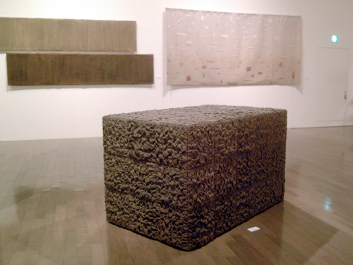
Existence of Cubic Form (2006)

In this piece, the object is divided into equal sized cubes, on one side 3x3 across, but 3x5 deep, creating a rectangular object out of the composition of the cubes. He creates regularity with the pattern of 3x3 and subsequently offsets that regularity on the side and top of the object. The divisions between cubes are subtle but noticable, enough to be visually significant, The dye tone of the jute is very even, however the uneven nature of the way it has been applied results in a diverse range of shadows that are reminiscent of soil.

There is comfort in regularity, and for me this is a very pleasing piece and well summarises the aspects of fibre arts and 3D work (particularly in combination) that appeal to me personally.The piece occupies very specific, precise amounts of space, but is tactile and warm in colour.

Existence of Cubic Form (2007)
This piece follows on the same themes as of the piece produced in 2006, partly indicated by it's name but also in very obvious visual ways. This time, the general dimensions of the work are geometrically even, except now the shape is cropped in such a way as to give the appearance of it sticking from the ground, or perhaps sinking into it, in such a way as to appear frozen in motion. In this image, the colour of the dye used appears to be the same or at least similar to the piece produced earlier.

The scale is altered slightly, with the object being 1.3 metres square on each sized, wheras the work from 2006 was smaller on it's similarly proportioned side by 40cm. The cubes themselves are again the same in proportion, but larger in size. All in all the pieces will occupy a similar amount of space, but the 2006 piece will appear more dense and the 2007 piece perhaps more massive. The pieces themselves are not particularly large, but the regularity of shape gives them a particular kind of monolithic presence, reinforced by the colour tone that Kizaki has chosen to use.

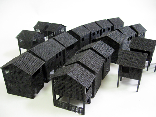
The Passage of a Village (2010)
More recently Kizaki has produced work more directly referencing man-made structures, continuing to use his previous techniques involving dyes and materials such as jute and wood. The result in this piece is represention of the repetition of houses – the house structures themselvse are not identical, but similar, and are arranged densely in such a way as to mask to a degree the individuality, in the way that occurs in society and in man-made structures all around us. A good example would be a row of terraced houses which at a distance may look very similar, be similarly sized and proportioned, but at closer inspection contain a myriad of differences, and as that inspection becomes closer and closer, more and more differences become apparent.

LEVEL OF DETAIL

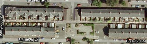
This is a series of images of a street I lived on last year, which consists of terraced houses. The images are a progression of incremental detail, from at a distance to up-close, taken from Google Maps and Google Street View. The purpose of the images is to demonstrate how we interpret details, what we notice and what we don't notice through distance


The rows of houses contain patterns of lines and dots, with cars breaking up the patterns, and the presence of a concrete space inthe middle (created after houses were knocked down years before due to subsidance) literally breaks the road into two parts, only accessible by foot.


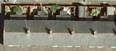
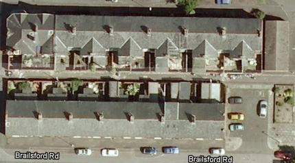
At the next level of examination the details of the yard spaces become more clear, the subtler differences in colour between the cars is more apparent, discolourations in the tarmac and also shadows cast by smaller objects are now visible. Technically, they were visible in the previous image, as the source is no different, but we are only capable of observing so much.
Closer still, the yards yield more information, and it is clearer to see who has plants and who has kitchen extensions, information that yields a great deal of personal information about who lives in each property. The power of tools like Google Maps and Google Street View to reveal this kind of information is extraordinary and provocative, allowing anyone access into the external environments of almost anyone in every major city, and beyond.


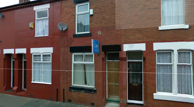
In this image we can see the highest level of detail, although the image has now changed. Through combining the two, we can determine a great deal of information that is very revealing. Because the house in the centre is the one I was living in, I am privvy to particular details that I can reveal, that enforce the parts of the image that are readily apparent. The house was a 'student' property, poorly maintained and in great need of redecoration, as evidenced by the cracking paintwork on the downstairs window ledge, the paint on the brickwork being inconsistent and also cracking away. The front door was cheap and flimsy, especially in comparison to the other doors visible in the image. The photograph reveals a lot of real information about the subject.


11 Nov 2011

Life Drawing

I missed Wednesdays session so I came in for Friday morning instead, to make it up.

This weeks area is the beginning of observing in more detail, the drawing of heads, hands and feet. These are typically problem areas for many people, myself included, and can offset an otherwise technically accurate drawing with frustratingly clumsy or inarticulate depictions of specific features.

We began by observing the models head first of all. We were advised that the general shape of the head tends to be fairly simple in most instances, and so beginning the drawing of proportions can be reduced to a simple geometric combination. Greg pointed out that when looking at a person, it is usually not just the front of the face that is visible but even the crown of the head. As we were advised, I began my drawings by creating a sketchy circular shape, and then adding lines to represent the jawline in whatever position it was meant to be, adjusting it bit by bit until it started to look reasonably accurate, gradually adding more detail but still keep it relatively rough.

The drawings were quick and simplistic.

Different poses provided different problems but were exciting to experiment with, particularly at speed.

The drawings were good opportunity to practise placement and proportion without  spending a lot of time  on perfecting details at this stage.


The drawings were not particularly of a high quality but provided me with an understanding of what to do in future drawings, and with practise I expect my drawings to improve more rapidly.

This drawing in charcoal uses the notion of negative space and inversion to create variations in tone, in a manner that I found particularly interesting and enjoyable. The charcoal was applied to the paper and rubbed in to create an overall block of tone, onto which areas were added to more thickly for definition, or removed with an eraser for highlights. The effects were subtle and quite dramatic, however the angle at which I was sitting in relation to the model for this pose made it difficult and I would have liked to apply this technique on a larger drawing containing more of the figure.
Drawing hands & feet is definitely a challenge in terms of adding detail, however the outline is reasonably straightforward to accomplish, particularly when working gesturally.