We moved into working with clay today, and were shown how to operate a pressing-type device that helps to roll out blocks of clay smoothly and evenly with minimal effort. The clay is moist when fresh and this affects how much it may stick to a surface. Smooth, glossy surfaces tend to stick the most, making them unsuitable for working with a lot of the time when attempting to create stencils or to roll onto/with the clay.
The clay is placed onto a sheet of cloth, and then compressed with hands so as to be somewhat flatter than it would be when removed from a block (with a cheese wire). Another piece of cloth is placed over the clay, and then the rolling cloth is then laid out over the clay as well. The layers of cloth that are added ensure that the clay does not stick to the board surface or to the rolling cloth, or that it does not stain it. The device has a wheel to the side of it which is rotated and in doing so, moves the press roller across the length of the machine, flattening out the clay.The machine is easy to operate and is not dissimilar to the kind of presses used for print making, and is adjustable too like those machines are. Once the clay has been pressed, it can be flattened out furthermore by using a rolling pin, using pieces of wood (of equal height) to brace the sides of the clay, providing a minimum level that the rolling pin can move across. This results in a more even surface of clay.
This practise of rolling can be used to apply pressure to objects placed over the surface of the clay, also. I used a stencil made from a small card box the previous day, which had a series of angular, geometric shapes cut into it. Flattened out, the box covered the area of most of the clay, and when I rolled over the stencil, a gentle impression was made into the clay. I continued to create more and more lines and geometric shapes, both by reusing the stencil in different configurations but also by applying indentations with an assortment of tools, mostly plastic clay modelling tools.
I decided to divide the piece into sections, again using strong lines in geometric shapes, to then assemble into a 3D construction. Before the pieces could be applied however, they needed to be leather hard, which is a state of dryness where indentations can be made into the surface of the clay, and it can be cut through, but bending or twisting the clay would cause it to split and tear. To speed up the process, I used a hairdryer on the pieces of clay until I was satisfied they were solid enough, though with hindsight it may have been easier to apply some of the pieces had they been a little bit drier still.
I started to 'feel' my way through creating the 3D piece, seeing which pieces I felt complimented each other in specific formations, as well as being wary of the piece being able to support itself. Being slightly too soft still, the piece was delicate. To bind the pieces together, lines are made into the clay (surface indentations still being relatively easy to make at this level of dryness) and then a composite of clay and water made into a thick sludge, called slick, is used to to bind the clay pieces together. The slick fills in the gaps created by the indentations on the connecting faces, which will dry to combine the pieces together solidly. The effect is rapid but takes more time to be of a decent strength, so the pieces need to be treated delicately still.
10 Nov 2011
9 Nov 2011
3D
In the 3D segment of the diagnostic term we have started by going back again to the summer project for inspiration (as well as any and all work we have been doing in other classes so far), in particular the theme of cardboard boxes as a material for drawing on, or simply carving directly into. With the piece I am working on, I am using a rectangular box about 1x1 foot wide/tall, and about half as deep. I opened the box out flat and started making geometric shapes in pencil on the inside of the box. The box was originally for cookware so the exterior is glossy and covered in graphics, so would not be appropriate for drawing onto without making it harder to see. Once I was satisfied with the complexity of the shapes and lines (all of which were straight, no curves), I decided which shapes would be cut out and which would not, and then went over the pencil lines for the shapes to be cut out in biro. This process allowed me to rapidly determine what kind of shapes I wanted to see. The end result I am working towards is stark simplicity, high contrast. I have painted the glossy exterior of the box in white (second coat pending) and I will be painting the interior of the box in a vibrant red, to create a sense of exposure, emphasising the gaps in the cardboard and indicating sensitivity inside. The box has holes made in three of the four sides, whist the base and top of the box are unchanged except for paint. I will be placing a second, much smaller box in the centre-base of the larger structure, following on the same colour theme, the interior white box contrasting again quite strongly against the red interior, with it's own red interior separate from it's exterior. Inversion, and contradiction, are the concepts I am experimenting with for this piece.
After applying the first coat of white paint to the large box, I needed to hang it to dry out of the way whilst I continued on with the cutting of the smaller box. There was a projector set up and still operating in the room. The cardboard box was hung up, unfolded, from the projector sheet, resulting in the projection (at the time, just the Windows desktop screen) being cast onto the box and subsequently through the exposed holes, creating a segmented impression on the wall as well as an uneven surface for the projection to land on as the cardboard dangled in mid-air. This was an unintended but also very relevant side effect, as I have long been interested in video projection, as a technology, a means of special effects and also as symbolic of cinema as a whole. One particular instance of projection that has always been interesting to me is when it is used during performance, in examples such as film production (for example, projections of moving backgrounds to represent the exterior of a car journey, filmed in a studio, usually giving a slightly peculiar impression of the outside world that is not entirely realistic). Another instance that I have enjoyed is during music performance, and I have seen this example used well by Neurosis and the related act, Tribes of Neurot, as seen on stage and also in the Neurosis DVD for 'A Sun That Never Sets'. Neurosis' members include one person, Josh Graham, whose main role is the visual accompaniment aspect, a role that is considered no less integral to the artistic concept of the group as a whole, and is not serving the purpose of purely advertisement or promotion, but rather furthering the expression of the collective members.
The imagery used during Neurosis' live performances tend to be quite abstract, but relative to the bands general musical themes of nature, humanism and universal truths in general. During different periods of the bands' existance, images have ranged from heavily altered nature footage or video of natural phenomena, to infamous video footage such as that of the televised suicide of disgraced American politician Bud Dwyer in 1987. The video imagery is used to reinforce the tone of the music, which is consistently dark, often oppressive, but just as often as it is compressed and dense it is open and sprawling, vast and unbound.
4 Nov 2011
Photography
The first stage of the photography unit covered the basic operation of Pentax SLR cameras, using a preset exposure level, manual focus control as well as a general introduction to approaching photographing a chosen subject.
I have always had an interest in photography, derived from my interest in cinema and cinematography, and I have enjoyed taking photographs using digital cameras in the past. My experience with traditional SLR cameras up until this point has been limited however so I am very keen to get more experience on their use, and using them to support my work now and in the future. Analogue photography is a more involved physical process, which in itself is fascinating to me, and allows for more 'incidental' effects to be discovered.
During the session today we shared a camera and a roll of 36 shots of black and white film, between groups of two or three. We went out around the college site to photograph anything of interest that came up, and I enjoyed not only taking my own photos, but discussing subjects, framing, light and visual patterns with my fellow students. The only downside that I found was that I could have continued taking a lot more than 12 photos (per person) and I continued to see points of interest beyond my allotted amount. The rolls of film we have been using will be developed between now and the next session a week from now, when we will develop photographs from the negatives using photopaper in the photography studio. I had some experience of this process (as well as developing rolls of film) previously at the college, when I was studying an AVCE Media Studies course in 2001, however my memory of the process is very vague by this point in time and I am eager to re-learn what I previously studied.
In terms of photography that I enjoy, I am always curious about experimental photography techniques, such as using long exposures and unconventional framing of images. I have found recently that using black and white photography (primarily with my own DSLR Sony A390 camera) results in starkly different results to colour photography, and these images contain a lot of 'drama' without a great deal of effort being required. Over the last year since buying this camera I have practised in both colour photography and black and white, and I am now leaning more towards black and white photography almost entirely, however I am wary of shutting off any options. There is a realm of experience in colour imagery that is entirely complex but in different ways, whilst there is a pure simplicity of monochromatic imagery that is both revealing in it's contrast but also distinctly mysterious. This is the power of film noir, of art-house cinema such as Eraserhead or Tetsuo: The Iron Man, films where the expected becomes twisted and distorted, in no short amount because of the removal of colour from the equation. Light and shadow become polarised, directly opposing each other instead of supporting one another, and so the roles that light and shadow play in the visual narrative change and become altogether more significant, whereas tradtionally (at least in contemporary work), colour leads our eyes and minds in many ways all at once. They are not so much different phrases of the same visual language, but almost different languages entirely.
I have always had an interest in photography, derived from my interest in cinema and cinematography, and I have enjoyed taking photographs using digital cameras in the past. My experience with traditional SLR cameras up until this point has been limited however so I am very keen to get more experience on their use, and using them to support my work now and in the future. Analogue photography is a more involved physical process, which in itself is fascinating to me, and allows for more 'incidental' effects to be discovered.
During the session today we shared a camera and a roll of 36 shots of black and white film, between groups of two or three. We went out around the college site to photograph anything of interest that came up, and I enjoyed not only taking my own photos, but discussing subjects, framing, light and visual patterns with my fellow students. The only downside that I found was that I could have continued taking a lot more than 12 photos (per person) and I continued to see points of interest beyond my allotted amount. The rolls of film we have been using will be developed between now and the next session a week from now, when we will develop photographs from the negatives using photopaper in the photography studio. I had some experience of this process (as well as developing rolls of film) previously at the college, when I was studying an AVCE Media Studies course in 2001, however my memory of the process is very vague by this point in time and I am eager to re-learn what I previously studied.
In terms of photography that I enjoy, I am always curious about experimental photography techniques, such as using long exposures and unconventional framing of images. I have found recently that using black and white photography (primarily with my own DSLR Sony A390 camera) results in starkly different results to colour photography, and these images contain a lot of 'drama' without a great deal of effort being required. Over the last year since buying this camera I have practised in both colour photography and black and white, and I am now leaning more towards black and white photography almost entirely, however I am wary of shutting off any options. There is a realm of experience in colour imagery that is entirely complex but in different ways, whilst there is a pure simplicity of monochromatic imagery that is both revealing in it's contrast but also distinctly mysterious. This is the power of film noir, of art-house cinema such as Eraserhead or Tetsuo: The Iron Man, films where the expected becomes twisted and distorted, in no short amount because of the removal of colour from the equation. Light and shadow become polarised, directly opposing each other instead of supporting one another, and so the roles that light and shadow play in the visual narrative change and become altogether more significant, whereas tradtionally (at least in contemporary work), colour leads our eyes and minds in many ways all at once. They are not so much different phrases of the same visual language, but almost different languages entirely.
3 Nov 2011
Fibre arts
Today was the concluding session in our diagnostic period for fibre arts. We have been asked to conclude, in one way or another, our active work and either to produce a final piece (although this is not necessarily the recommended choice) or to present the samples and work we have already created, alongside a body of artist research. I struggled to think of ways to collate the work I had already done, as the majority of it did not have much in the way of rationale behind it, and after looking through some books of various textile artists I decided that it would be more interesting to invent some other way of presenting the work, preferably with an emphasis on 3D, or at least a more physical representation.
I began this process a little bit yesterday, with the piece of work using bondaweb:
On the top right corner of the piece, I added a hook, similar to that you might find on a tea-towel or an item of clothing, for hanging. I liked the idea of the piece being something practical in a sense at least, something that can be hung up anywhere, taken from one context to another. This idea stuck with the direction I'm taking the presentation of the work overall. At first, I stitched three pieces of work that were similar sizes and proportions to each other, two of which were made in the same method, the third in the centre being unrelated in design. From here, I thought about ruffling some fabric and then stitching the three pieces onto it, but after experimenting with pins and observing the contrast of the materials, I decided that this looked flat and rather bland. I then started toying with the composite piece sewed it together in on itself, creating a tube, which I then sewed up one end of, contorting the shape. There is more I would like to do with this, but I am unsure as of yet what exactly it is that I am moving towards.
Later, I decided that I could stitch all the remaining sample pieces on to one large piece of fabric, that itself would in turn be sewn into a type of bag, which I may stuff with other material. This would create a physical object that presents the work I have done, that can be handled and that encourages experience of texture and physicality. Similar to my interests in spaces, I have a related interest in the inverse nature of space, which is of course the occupation of space, into which there is a further layer which is the surface of occupied space. We live and work in spaces, but the items that we fill these spaces with are ultimately what occupy us ourselves.
I began this process a little bit yesterday, with the piece of work using bondaweb:
On the top right corner of the piece, I added a hook, similar to that you might find on a tea-towel or an item of clothing, for hanging. I liked the idea of the piece being something practical in a sense at least, something that can be hung up anywhere, taken from one context to another. This idea stuck with the direction I'm taking the presentation of the work overall. At first, I stitched three pieces of work that were similar sizes and proportions to each other, two of which were made in the same method, the third in the centre being unrelated in design. From here, I thought about ruffling some fabric and then stitching the three pieces onto it, but after experimenting with pins and observing the contrast of the materials, I decided that this looked flat and rather bland. I then started toying with the composite piece sewed it together in on itself, creating a tube, which I then sewed up one end of, contorting the shape. There is more I would like to do with this, but I am unsure as of yet what exactly it is that I am moving towards.
Later, I decided that I could stitch all the remaining sample pieces on to one large piece of fabric, that itself would in turn be sewn into a type of bag, which I may stuff with other material. This would create a physical object that presents the work I have done, that can be handled and that encourages experience of texture and physicality. Similar to my interests in spaces, I have a related interest in the inverse nature of space, which is of course the occupation of space, into which there is a further layer which is the surface of occupied space. We live and work in spaces, but the items that we fill these spaces with are ultimately what occupy us ourselves.
Fibre arts
Today's session was a good extension on what we had been doing previously. We looked largely at transferring, and I spent a good deal of time working on using transferable wax crayons on paper and using a press to transfer the wax colours from paper onto the fabric. The results were surprisingly good, at least on the artificial fabrics, where the colour transferred very cleanly and smoothly, almost loosing no detail in the texture.
Above are the wax on paper originals, with lettering done in reverse on the first example so that lettering comes out in the right direction on the print. With these pieces, there wasn't much attachment in my mind to the notion of using sewing objects as inspiration, and I decided I would rather pursue a different direction. I decided to use a stencil and reproduce my date of birth, tying the work at least superficially to myself in a direct manner. I then used other elements of the stencil to create solid lines and blocks, and using the underside of buttons to create reproductions of the four holes, in turn creating a pattern of these. I tried to keep the colour usage minimal, so as to be high contrast and to work blue shapes around red numbers, and vice versa. This was actually the second plate I produced, the first one being the second image above - which is mostly freehand drawing with button relief, and where I started experimenting with the pattern of the four dots from the underside of buttons.
2 Nov 2011
Life drawing
Today we looked at composition at an experimental level. We began by doing quick test drawings of the model, framing elements and then developing a chosen element into a larger piece of work.
Recently I have had difficulty in drawing, and I believe the issue for me is the medium and my lack of comfort with it, namely working in pencil. I prefer working gesturally and although I could quite comfortably continue working in loose mediums like charcoal, I do feel that I need to improve my skills on a technical, realistic level, and so I have been trying to persevere with pencil work. However, this led to frustration and with the initial drawing attempts that I was making in pencil, the results were unsatisfactory and abortive. As time was running out to complete this stage of the work for the day, I decided I need to have something solid to work with so I quickly went back to doing a quick charcoal drawing, drawing fast and loose and although the results were not as I would have hoped, I felt more prepared to go onto the next stage.
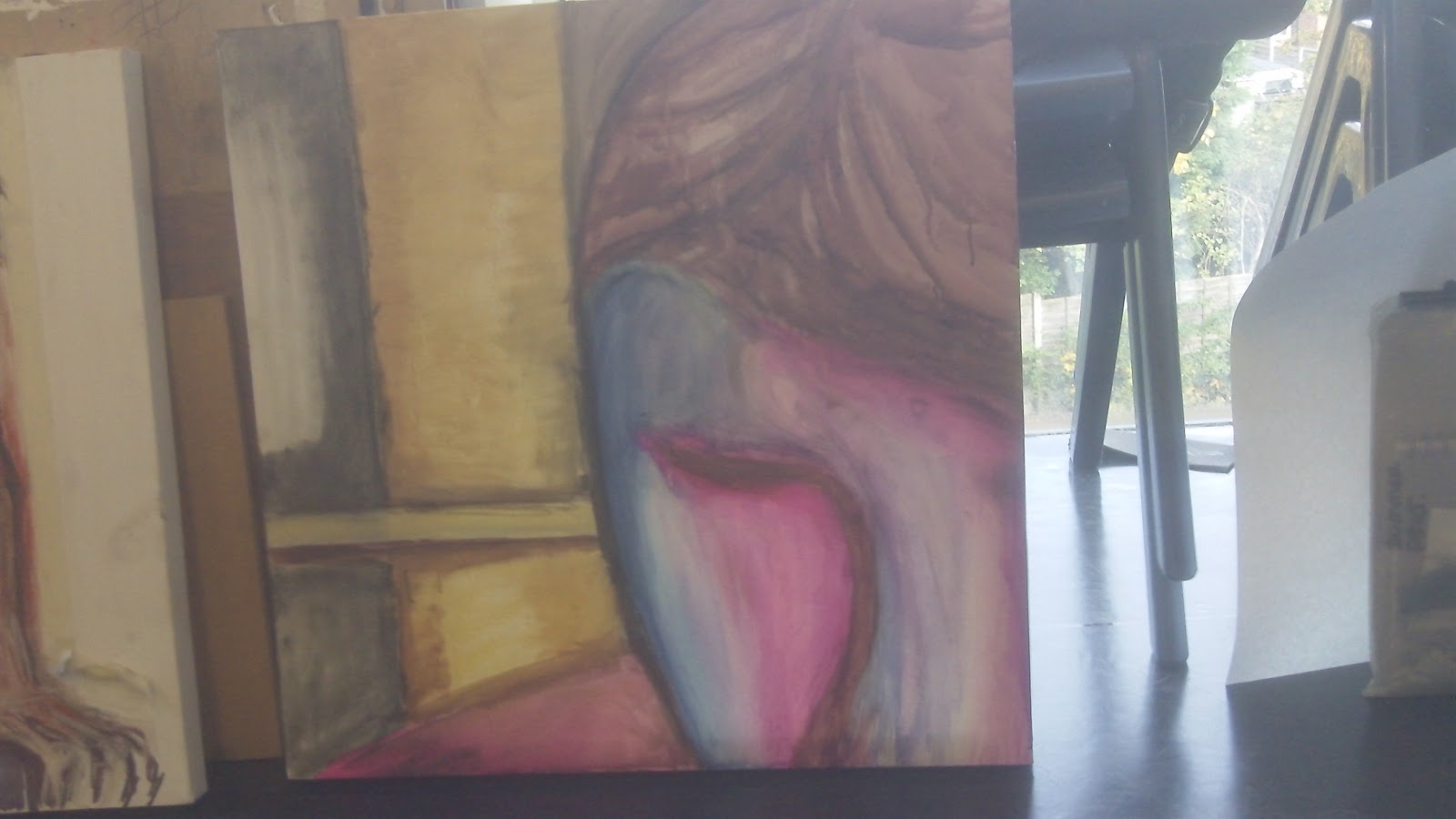
We had a selection of medium available to us to use, and today also marked the beginning of using colour in tone to develop the image. We had the option of using inks for the first time, which I found a very exciting notion, as I felt this could continue in the gestural expressive style that I favour. There were only three shades to use, which created an interesting limitation to work around, and the colours were quite strong so I knew from the outset that the results would be striking at least. We had available to us Prussian blue, crimson (more pink a shade than I expected) and brown, and I spent a good deal of time experimenting with the use of water to thin out and great variations in tone. There is definitely a lot more I would like to do with inks and the piece that I began in the session needs more work, which I aim to continue on with outside of the designated session time before next week.
Recently I have had difficulty in drawing, and I believe the issue for me is the medium and my lack of comfort with it, namely working in pencil. I prefer working gesturally and although I could quite comfortably continue working in loose mediums like charcoal, I do feel that I need to improve my skills on a technical, realistic level, and so I have been trying to persevere with pencil work. However, this led to frustration and with the initial drawing attempts that I was making in pencil, the results were unsatisfactory and abortive. As time was running out to complete this stage of the work for the day, I decided I need to have something solid to work with so I quickly went back to doing a quick charcoal drawing, drawing fast and loose and although the results were not as I would have hoped, I felt more prepared to go onto the next stage.
We had a selection of medium available to us to use, and today also marked the beginning of using colour in tone to develop the image. We had the option of using inks for the first time, which I found a very exciting notion, as I felt this could continue in the gestural expressive style that I favour. There were only three shades to use, which created an interesting limitation to work around, and the colours were quite strong so I knew from the outset that the results would be striking at least. We had available to us Prussian blue, crimson (more pink a shade than I expected) and brown, and I spent a good deal of time experimenting with the use of water to thin out and great variations in tone. There is definitely a lot more I would like to do with inks and the piece that I began in the session needs more work, which I aim to continue on with outside of the designated session time before next week.
28 Oct 2011
Spaces 2
A second attempt at the panoramic view effect, with editing of the composite images in photoshop. The effect is still uneven, due to the 90 degree angle at which the photographs were taken. In order to re-align the contents of the images, sections had to be resized and moved which left uneven white spaces, which I removed by cropping the image, removing the advantage of having the camera at 90 degrees.
24 Oct 2011
Visual Communication: Conclusion
Visual
Communication
"WE
KNOW YOU KNOW NOTHING / SIT DOWN SHUT UP & BUY MORE SHIT"
The
initial impetus for this project came from our summer project, and
our chosen subject of landscape from the options given to us in the
original brief (playground, docks, woodland etc). My choice for the
summer project whoever ended up becoming fairly irrelevant to this
project, as through free-assocation I began to think more about the
circumstances surrounding the summer project rather than the project
itself. When the brief was sent out to students, I was still in full
time employment, working for a large firm of conveyancers (property
lawyers), a job that I was in a great hurry to leave and was deeply
unhappy with. The initial thoughts about the summer project that I
was putting down on paper were largely unemotive and fairly typical,
mainly to do with architecture and as such as I was straining to
conjure anything of any real interest to develop upon. I am very much
interested in architecture, space and the significance of our
presence in specific environments, but I found the summer project
brief to be fairly limiting with regards to this and I was struggling
to make each area connect. At this point, I began to think more about
my time in employment, as a loose connection to the summer project,
and very quickly thoughts and feelings began to surface.
The
feelings underpinning most of what I wrote down were very negative. I
felt deep frustration with the job, with how my time there ended, and
with particular personalities in the organisation that I felt made my
life more difficult or less enjoyable outside of work. There were
factors about the job that affected my relationships with other
people, and my physical and mental wellbeing. I felt great resentment
and hostility, and although the feelings being summoned were
thoroughly negative, there was a sense of righteous anger and
satisfaction in bringing it up and writing it all down, itself not a
characteristic that I am comfortable with in others and subsequently
much less so in myself. I would rather move forwards and allow
positive things to come to me instead of dwelling purposely on
negative feelings and experiences.
I
often find myself in great dismay at the current state of politics in
the world at large, with how companies large and small treat their
staff and exploit people's needs and fears. Politicians lie and
mislead, scheme and cheat, and we are now in a situation in this
country where we are effectively powerless to stop them – when the
votes of so many became worthless, because no matter what is said or
how much protestation might occur, the machine keeps on rolling
forwards regardless, stripping us of all the support systems we rely
upon, to the point where our human rights are at risk. This dismay
and anger that I feel towards these groups extends furthermore to
those that might try and push me in one direction or another to suit
themselves, and this is the central driving point in the work that I
have produced in this project.
The
original phrase that was the focal point for the project was "We
Know You Know Nothing", implying complicit ignorance, a
patronising acknowledgement of weakness in the face of authority, a
sense of resignation to our fate as subservients, and the idiocy of
beurocracy. I worked on several images with variations on orientation
and emphasis, as well as overall placement and repetition, with an
interesting variety of results.
RESEARCH:
See
also polish film posters comparison
EXPLOITATION,
CENSORSHIP AND HYSTERIA
I
have long had an interest in censorship, particularly with regards to
cinema, and so as a result I have often come across exploitation
cinema as a point of interest. My
view of censorship is that it is a failure for audience and art to
relate in an even enough ratio, for whatever reason,
whether it's because of moral outrage or for political reasons, or
both. It is by definition a fluid state – what may have been
indecent or considered damaging fifty years ago may not be considered
the same way now, or vice versa. Social standards shift and change
over time, and although some notions tend to stay fairly constant
(child cruelty for example), issues of racism, sexism, homophobia and
acceptable images of violence have all changed dramatically in the
last century. What makes work so objectional that we are not to be
allowed to view it, an arbitrary decision made by those in power
supposedly on our behalf – indeed, who has the right to choose for
any of us what we can and cannot see, listen to or read, under the
proviso that it be for our own protection? Often, work is censored or
attempts are made to restrict access to material out of the supposed
fear that it might incite violent behaviour, but evidence for such
claims is usually anecdotal at best, or outright fabricated at worst.
In Britain, we have the 1984 Video Recordings Act solely because of
the moral outrage that came about as a result of Christian pressure
groups such as the Festival
of Light or
career-oriented Conservative politicians and high-ranking police.
In
America in the 1980's, there was considerable efforts made by
Christian-right groups such as the Parents Music Resource Centre (led
by Tipper Gore, wife of Al Gore) to effectively ban works by forcing
record labels to use '"Parental Advisory" stickers, which
in turn would blacklist certain recordings from major retailers, such
as Wal-Mart. This wide-range blacklisting could effectively prevent a
release from seeing the light of day, such is the market dominance of
these companies. The "Parental Advisory" sticker itself has
absolutely no legal power and the PMRC had no legislative powers
whatsoever. The PMRC of course would not admit to seeking to ban
artists, only to prevent objectionable material falling into the
hands of impressionable youth, but their actions directly limited the
accessibility of these works for adults, and indrectly affected the
freedom for artists to speak freely with their music. Strongly
political groups such as the Dead Kennedy's, as well as rap groups
such as N.W.A, Public Enemy and 2 Live Crew with violent and/or
sexual themes in their lyrics, were significant targets. Heavy metal
bands such as Judas Priest, Twisted Sister, Venom and Black Sabbath
were targeted for violent, sexual or supposedly satanic themes, amid
an air of so-called 'satanic panic' that was a popular topic for TV
chat shows at the time, and well into the 1990's. Such 'satanic
panic' is also largely responsible for the infamous case of the 'West
Memphis Three', three teenagers imprisoned for the murder of three
eight year-old boys in 1994, on circumstancial evidence including
owning black t shirts, listening to Metallica and being interested in
the occult. The three have recently been released from prison after
eighteen years, as part of a bizarre plea deal. One of the three,
Damien Echols, was on death row. All three are continuing to try and
clear their names.
The
power of censorship, hysteria and manipulation of public opinion have
influenced the themes in my work for this project. Coercion,
exploitation and control are themes that deeply bother me, and I look
to explore these issues more in the future.
V1-V3
are variations on the same visual motif, with the image emphasising
the authoritarian element of the theme, with the instruction to be
silent as demonstrated with the 'hushing' silhouette. The variations
on text produce a variety of different readings of the same basic
sentence, with V1 implying dual levels of ignorance, with V2
emphasising the word 'know' as a constant whilst all the other
elements gradually fade to obscurity, which is a direct
counter-message to V1. V3 is or less a reworking of the same
principle used in V1, except with the text kept closer together and
emboldened for greater emphasis.
V4
stands out from all the other designs as a considerably more
simplistic approach, relying purely on the boldness of the text to
make it's impact. The central feature dominating over all else is the
abbreviation NDA, which stands for "Non Disclosure
Agreement", a direct reference to events at my place of
employment where staff were forced to agree not to disclose
information about the company and it's dealings with other third
parties. There was no choice in the matter, and if staff refused then
it would likely affect their continued employment there. I felt this
was pure coercion in a manner that, whilst fairly innocuous there (I
for one did not much care at all about the companies interests, as
their interests never did represent my own at any point beyond that
they continued to pay me), the principle of a NDA and the power which
it grants an employer or other party over an individual is
frightening to me as a concept. Furthermore, by signing such an
agreement, you are signing yourself over to third parties who have
next to no concern for your interests.
The
NDA motif did not remain in the design past this point, as it
was too vague a term to adequately convey the messages I wanted to
put across, however I was pleased with the absolute nature of the
black-on-black text against white background – it does create a
sense of strong pressure.
V5
is a development on the idea of the 'hush' motif, and was created by
first all photographing myself, then using a graphics tablet in
photoshop to trace over the key lines and creating a basic outline on
which to add colour. The colour scheme chosen was design to create
reasonably high contrast, the use of red, white and blue for the text
(hastily 'scratched' into place, again with a graphics tablet)
conjuring nationalistic themes and subsequently, government.
The
red lines placed over the mouth and eyes emphasise the 'hush' motif
further, but do not reappear as I feel this lessens the authoritarian
element and again hints at it being more responsive to
authoritarianism instead. The entire purpose of the piece is for it
to be an affront, to be abrasive and objectional in as far as to be
putting people 'in their place'.
V6
shows the introduction of the second phrase, "SIT DOWN SHUT UP &
BUY MORE SHIT". I wanted to use this text boldly to be a direct
attack, an order and an attempt at pushing people down. The line
itself is loosely drawn from an anecdote by Henry Rollins, taken from
one of his 'spoken word' performances, where he is discussing the
possible benefit of there being an electronic notice on a plane,
similar to a "no smoking" or 'fasten your seatbelt"
sign, instead saying "sit the fuck down and shut the fuck up",
the context being that trying to board an aircraft full of bumbling
American tourists (Rollins himself is American but often critical of
American culture) is a particularly unpleasant experience.
The
design itself is tighter and also includes a tagline, like you might
find on food advertising. This was meant to be sardonic, but again
ultimately I felt it undercut the overall impression that I was
trying to create, so I did not use it again.
The
vertical alignment of the text carried through into what would become
the final version of this piece, with the text rolling down the right
side of the page, however in quite a modified form ultimately. The
original phrase, "We Know You Know...", although absent in
this design, comes back in another version after being tested again
in a variety of orientations. I wanted to create a kind of logo,
something symbolic of a possible order of rule or authority, that
summarised all the of main facets of the design (superiority,
silence, confusion).
The
logo would find itself used in conjuction with the other phrase,
sharing the space with a variety of shapes and colour blocks, as well
as the subtle inclusion of one other element, a combination of a
tracing of a photograph of workers in a supermarket bakery (the
tracing and subsuqent colourisation creating a rather ghoulish
effect) with a portion of the logo design repeated in triplicate, to
enforce the idea that workers are subservient to the rule. With the
colour scheme being limited to green, red and black, the image had to
be fairly carefully manipulated to fit in relatively unnoticed, and
sits inside a block of colour to the top of the design.
I
wanted the piece to be uncomfortable and for a while I was at risk of
making things too symetrical, too much of a straightforward piece of
graphic design, which then led on to the slight skewing of the
vertical text, the inversion of part of the text toward the bottom,
and the uneven blocks of colour inversely interacting with each
other, leading downwards. Finally, I added a high-resolution scan of
a test print I did into my journal of the words 'buy' and 'shit, and
used it as a background layer to add a greater sense of texture,
again to make it less comfortable and less like a straightforward
piece of graphic design. This test page was from four similar pages,
and was done to see if I could use print as a means of achieving the
uneven effect I wanted. For some while I was considering the use of
screenprinting, but with the addition now of the extra layer of the
scanned page, this would not ultimately give me the control required
to replicate the image as precisely as the source material dictates.
Instead, I am taking the Photoshop file to a printers to reproduce at
full-scale (around A1/A2 size, in length at least).
I produced a second piece for comparison, this time using more of a deliberate sense of symmetry but re-using the background image again to create the uneven texture. I feel it is less successful but this also serves to illustrate the ways in which the first piece succeeds instead. The high contrast and high resolution of the background image however is quite dramatic and in using high resolution scans I have noticed great potential for creating texture for further digital works out of analogue creations.
20 Oct 2011
Fibre Arts
In our second fibre arts session, we began with an exhaustive list of artists who work in textiles, both in 3D and more two-dimensional styles, under the umbrella term of fibre arts. Of these, the following caught my attention in particular:
Sheila Pepe
Janet Echelman
Susie MacMurray
Shelley Rhodes
Caroline Bartlett
Michael Brennand Wood
Ma Ke
More on these later.
The remainder of the session was almost entirely practical, with the aim to try out and experiment with a variety of different techniques using a sewing machine, an embellisher, dyes, 'stitch and reveal'. I spent a considerable amount of time with the sewing machines, as I have never used them before and I found them intriguing. It took me some time to get to grips with the basics of the machine, and I wanted to practise more so I spent perhaps more time on the machines than was intended. As such, of the pieces I produced, most were made with the use of the sewing machine.
Sheila Pepe
Janet Echelman
Susie MacMurray
Shelley Rhodes
Caroline Bartlett
Michael Brennand Wood
Ma Ke
More on these later.
The remainder of the session was almost entirely practical, with the aim to try out and experiment with a variety of different techniques using a sewing machine, an embellisher, dyes, 'stitch and reveal'. I spent a considerable amount of time with the sewing machines, as I have never used them before and I found them intriguing. It took me some time to get to grips with the basics of the machine, and I wanted to practise more so I spent perhaps more time on the machines than was intended. As such, of the pieces I produced, most were made with the use of the sewing machine.
| Stitching and folding |
| Folding with stitch |
| Stitch and reveal |
| Stitch gauze over wool thread, onto white material (1/2) |
| Additional stitches to hold over the thread, and keep it in place, and also to segment the fabric into cubes (2/2) |
![]() |
| Wax relief onto fabric, with dyes washed over the fabric (high resolution scan). Wax was rubbed onto the fabric over various shapes, as well as being rubbed freehand onto the material. |
19 Oct 2011
Fibre Arts
The first session of our fibre arts block was a little confusing, as it actually involved virtually no work with fibre arts, and our brief wasn't supplied on the day. We began by working on a similar exercise to what we did in the Fine Art block, early on, with drawing items in boxes, however despite my initial apprehension, this turned out to be a much more relaxed process than before. The items included a variety of shapes and textures, and the emphasis this time was not on detail and accuracy, but simply reproducing the shapes quickly. This ended up being quite liberating and I was able to be quite gestural and loose with the representation. We repeated this exercise several times, rotating the materials we were drawing as well as the materials we were drawing with. We began with graphite, and moved onto some less conventional means, including taping two pencils together in an effort to reduce control, which provided some interesting results. We also used Berol markers, with added water applied by brush to disperse the ink in a manner similar to watercolour paints, and this is a technique I want to try out more as the effects were interesting and very easy and fast to implement. We used indian ink, applied with skewers and also brushes, which is also something I would like to use more, perhaps in other ways.
After a while we had produced several different drawings, on a variety of types of paper, and we then were asked to create a collage of sorts out of the drawings, with the option of cutting and re-aligning the pieces. I decided to do this with all my drawings, feeling that the direction the work was heading in at the time was not overly engaging me, and that I would perhaps find more interesting results if I went further into abstraction. I arranged the pieces in such a way as to try to follow some some curves and lines throughout. I used sticky labels to hold pieces together temporarily, as I threaded through the outlines of the pieces straight onto an A2 sized piece of paper, rather than piece the work together first and then apply to paper later. At first, the needle I was using was too broad and it proved extremely difficult (and painful at times) to penetrate two or three layers of paper at once, and after a while I switched to a smaller, sharper needle which was easier to manipulate, however I managed to scratch and poke my fingers multiple times in the process. This has been the most physically painful unit so far.
Life drawing
Today's session was a little bit frustrating as I have been feeling my limitations in drawing coming to the fore gradually over time as the course progresses. I think the heart of it lies in my lack of practise of measurement, and my impatience. I know that I need to spend the time on the initial stages, and in order to do that I need to relax and become more comfortable with that stage. Working gesturally is my preferred method, and I need to find the harmony between gestural drawing and the more 'academic' notion of measurement.
| Effectively unfinished, the lower half of the drawing is underdeveloped, but with attention to detail increased in the top half of the drawing. |
Subscribe to:
Posts (Atom)