Hideaki
Kizak’s background is primarily in dying, and his key concern is
the use of dying techniques traditional to Japan and other Asian
countries. His work uses materials and colour tones in uniformality,
creating variation through surface texture, occupying space in both
regular and irregular ways.
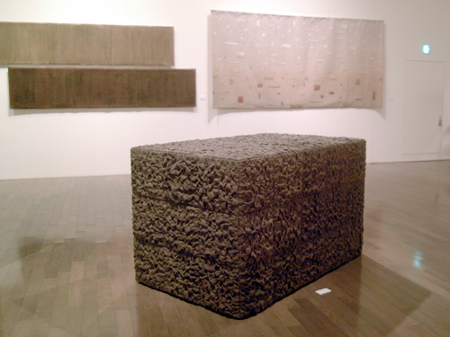 |
| Existence of Cubic Form (2006) |
In
this piece, the object is divided into equal sized cubes, on one side
3x3 across, but 3x5 deep, creating a rectangular object out of the
composition of the cubes. He creates regularity with the pattern of
3x3 and subsequently offsets that regularity on the side and top of
the object. The divisions between cubes are subtle but noticable,
enough to be visually significant, The dye tone of the jute is very
even, however the uneven nature of the way it has been applied
results in a diverse range of shadows that are reminiscent of soil.
There
is comfort in regularity, and for me this is a very pleasing piece
and well summarises the aspects of fibre arts and 3D work
(particularly in combination) that appeal to me personally.The piece
occupies very specific, precise amounts of space, but is tactile and
warm in colour.
 |
| Existence of Cubic Form (2007) |
This
piece follows on the same themes as of the piece produced in 2006,
partly indicated by it's name but also in very obvious visual ways.
This time, the general dimensions of the work are geometrically even,
except now the shape is cropped in such a way as to give the
appearance of it sticking from the ground, or perhaps sinking into
it, in such a way as to appear frozen in motion. In this image, the
colour of the dye used appears to be the same or at least similar to
the piece produced earlier.
The
scale is altered slightly, with the object being 1.3 metres square on
each sized, wheras the work from 2006 was smaller on it's similarly
proportioned side by 40cm. The cubes themselves are again the same in
proportion, but larger in size. All in all the pieces will occupy a
similar amount of space, but the 2006 piece will appear more dense
and the 2007 piece perhaps more massive. The pieces themselves are
not particularly large, but the regularity of shape gives them a
particular kind of monolithic presence, reinforced by the colour tone
that Kizaki has chosen to use.
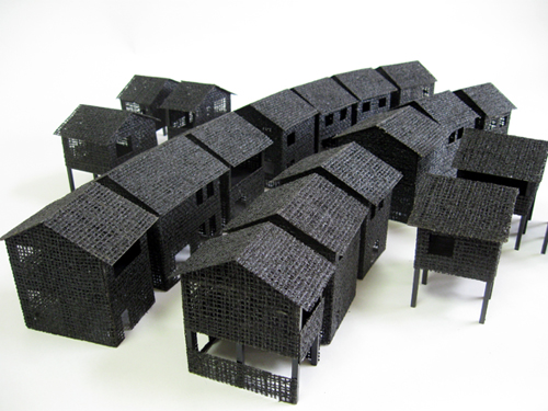 |
| The Passage of a Village (2010) |
More
recently Kizaki has produced work more directly referencing man-made
structures, continuing to use his previous techniques involving dyes
and materials such as jute and wood. The result in this piece is
represention of the repetition of houses – the house structures
themselvse are not identical, but similar, and are arranged densely
in such a way as to mask to a degree the individuality, in the way
that occurs in society and in man-made structures all around us. A
good example would be a row of terraced houses which at a distance
may look very similar, be similarly sized and proportioned, but at
closer inspection contain a myriad of differences, and as that
inspection becomes closer and closer, more and more differences
become apparent.
LEVEL OF DETAIL
 |
| This is a series of images of a street I lived on last year, which consists of terraced houses. The images are a progression of incremental detail, from at a distance to up-close, taken from Google Maps and Google Street View. The purpose of the images is to demonstrate how we interpret details, what we notice and what we don't notice through distance |
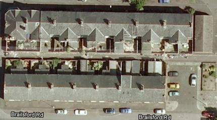 |
| The rows of houses contain patterns of lines and dots, with cars breaking up the patterns, and the presence of a concrete space inthe middle (created after houses were knocked down years before due to subsidance) literally breaks the road into two parts, only accessible by foot. |
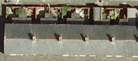 |
At the next level of examination the details of the yard spaces become more clear, the subtler differences in colour between the cars is more apparent, discolourations in the tarmac and also shadows cast by smaller objects are now visible. Technically, they were visible in the previous image, as the source is no different, but we are only capable of observing so much.
Closer still, the yards yield more information, and it is clearer to see who has plants and who has kitchen extensions, information that yields a great deal of personal information about who lives in each property. The power of tools like Google Maps and Google Street View to reveal this kind of information is extraordinary and provocative, allowing anyone access into the external environments of almost anyone in every major city, and beyond.
|
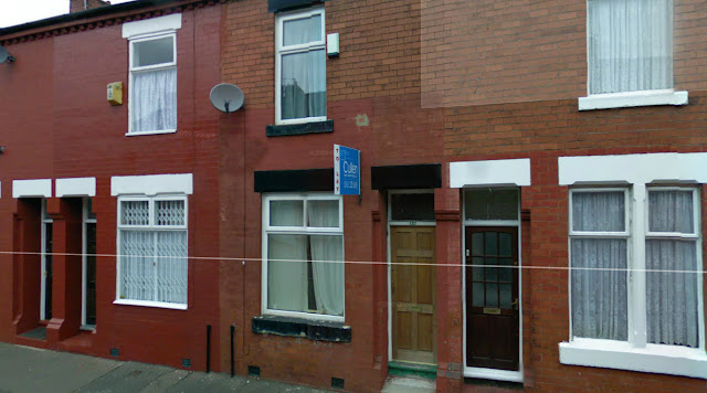 |
| In this image we can see the highest level of detail, although the image has now changed. Through combining the two, we can determine a great deal of information that is very revealing. Because the house in the centre is the one I was living in, I am privvy to particular details that I can reveal, that enforce the parts of the image that are readily apparent. The house was a 'student' property, poorly maintained and in great need of redecoration, as evidenced by the cracking paintwork on the downstairs window ledge, the paint on the brickwork being inconsistent and also cracking away. The front door was cheap and flimsy, especially in comparison to the other doors visible in the image. The photograph reveals a lot of real information about the subject. |